As a trans-femme on HRT, I would like to know the concentrations of estradiol in my blood at all hours of day. This is useful as the peak, the trough and average all have effects. However, I only get blood tests a finite number of times per day – usually once. I am not a medical doctor, but I am the kind of doctor who can apply scientific modelling to the task of estimating curves based on limited observations. I am honestly surprised no one has done this. The intersection of trans folk and scientific computing is non-trivial. After all, the hardest problem in computer science is gender dysphoria.
To do this we are going to use probabilistic programming, to get a distribution of possible level curves. This is a great use-case for probabilistic programming. We have a ton of domain knowledge, but that domain knowledge has a few parameters we don’t know, and we have only a little data. And crucially we are perfectly fine with getting a distribution of answers out, rather than a single answer.
This is my first time using probabilistic programming, though I have been aware of it for many years. I just rarely come across a problem that it would be great at. But this is one. This blog post is me finally learning and using probabilistic programming.
We begin by considering the shape of the curve. The way levels change over time is the single largest piece of domain knowledge we have. We wish to construct a parameterized curve where the shape can be varied by adjusting to parameters.
In this blog post on Sublingual versus Oral Estrogen they approximated the estradiol function with a linear to the peak then an exponential decay.
I plotted points from the sublingual estradiol curve, and came up with an estimate of the estradiol function from 1 hr to 24 hours as being
350.54*(HOURS^-0.907). From 0 to 1 hours, I estimated the estradiol level linearly, as451*HOURS.
I am today interested in the estradiol function for estradiol gel. It’s the same shape, so a similar strategy should apply.
Järvinen A, Granander M, Nykänen S, Laine T, Geurts P, Viitanen A (November 1997). “Steady-state pharmacokinetics of oestradiol gel in post-menopausal women: effects of application area and washing”. Br J Obstet Gynaecol. 104 Suppl 16: 14–8. doi:10.111/j.1471-0528.1997.tb11562.x. PMID 9389778. S2CID 36677042.
give 3 curves for single dose.
Which are also available from Wikimedia Commons. Plots below:
![]() These 3 curves in that study were from applying the gel over larger or smaller areas.
For our purposes that doesn’t matter.
We instead can think of them them as 3 different realistic curves, which have some differences based on various causes (be they application area, location, physiology etc).
We will then estimate the parameters of those curves.
These 3 curves in that study were from applying the gel over larger or smaller areas.
For our purposes that doesn’t matter.
We instead can think of them them as 3 different realistic curves, which have some differences based on various causes (be they application area, location, physiology etc).
We will then estimate the parameters of those curves.
Before we do anything else though, we start by setting up our Julia environment.
using Pkg: @pkg_str
pkg"activate --temp"
pkg"add Tables@1 Plots@1 Turing@0.21.12 MCMCChains@5.5 LsqFit@0.13.0 StatsPlots@0.15.4"
The curve we want defines the current blood concentration of estradiol c at time t hours after application of the gel.
It is described by 3 parameters:
c_max: the peak concentration.t_max: the time it takes to reach peak concentration.halflife: the time it takes for the concentration to half after reaching peak.
(The same curve, with different parameter values likely works for other methods of adminstration)
We express this as a higher order function of the 3 parameters, which returns a function of time t.
function single_dose(c_max, halflife, t_max)
    function(t)
        if t < t_max
            c_max/t_max * t
        else
            c_max * 2^(-(t-t_max)/halflife)
        end
    end
end
Let’s see how we did. I am going to plot the data from Järvinen et al against curves using my formula, best fit by my own inspection. I am downshifting all the data from Järvinen et al by 25 pg/mL, as that data was from post-menopausal cis women, who produce about 25 pg/mL of estradiol on their own before you take into account HRT. We only want to model the HRT component.
using Plots
plot(layout=(1,3))

plot!(
    0:0.1:24, single_dose(132, 3.5, 3),
    label="A200 predicted"; linecolor=:red, subplot=1, yrange=(0,130),
)
scatter!(
    [0,1,2,3,4,6,8,10,12,16,24], [0,25,100,132,90,82,60,55,32,15,4],
    label="A200 actual", markercolor=:red, subplot=1, yrange=(0,130),
)

plot!(
    single_dose(100, 3.5, 2.5),
    label="A400 predicted", linecolor=:magenta, subplot=2, yrange=(0,130),
)
scatter!(
    [0,1,2,3,4,6,8,10,12,16,24], [25,35,70,75,55,45,35,32,22,15,4];
    label="A400 actual", markercolor=:magenta, subplot=2, yrange=(0,130),
)

plot!(
    single_dose(20, 3.5, 2.7),
    label="Amax predicted", linecolor=:blue, subplot=3, yrange=(0,130),
)
scatter!(
    [0,1,2,3,4,6,8,10,12,16,24], [5,14,17,20,12,10,5,2,5,5,4];
    label="Amax actual", markercolor=:blue, subplot=3, yrange=(0,130),
)
By looking at these plots, it seems a pretty decent model. Of-course with enough degrees of freedom, you can fit an elephant. However, we have 10 points and only 3 degrees of freedom, of which we only varied 2 of them across the 3 datasets. So it seems like we are good.
It’s broadly biologically plausible. We expect a fast initial absorption, that should end at some point in few few hours. Since it is fast and short, it doesn’t really matter what we model it with, so linear is fine. Then we expect a tail off as it is consumed. It makes sense for the rate of absorption to be related to the quantity remaining – which suggests some exponential. We see this kind of thing very frequently in biological systems. This all might be nonsense, I am no systems biologist.
Now I just fit those curves by eye. We can find the the most likely parameters via least squares regression. For this we can use LsqFit.jl, normally I would use Optim.jl and write the least-squares problem out myself, and use L-BFGS to solve it. But LsqFit.jl’s Levenberg-Marquardt algorithm is more appropriate.
using LsqFit

fit = curve_fit(
    (t,p)->single_dose(p...).(t),
    [0,1,2,3,4,6,8,10,12,16,24], # t values
    [0,25,100,132,90,82,60,55,32,15,4], # c(t) values
    [132, 3.5, 3]  # initial guess at parameters
)

c_max, halflife, t_max = fit.param
@show c_max halflife t_max

plot(
    0:0.1:24, single_dose(c_max, halflife, t_max),
    label="A200 predicted"; linecolor=:red,
)
scatter!(
    [0,1,2,3,4,6,8,10,12,16,24], [0,25,100,132,90,82,60,55,32,15,4],
    label="A200 actual", markercolor=:red,
)
c_max = 125.66238991436627
halflife = 4.883455201973709
t_max = 2.7924975536499423
That is indeed a nice close fit.
This least square fit is a maximum likelihood estimate (MLE), it is the curve which maximizes the likelihood of the parameters. But really we are not after a single curve at all. We are interested in distributions over possible curves, given the observations. These tell use the possible realities that would explain what we are seeing.
To do this we will use probabilistic programming. In particular the Turing.jl library. This is an ideal use case for probabilistic programming. We have a bunch of domain knowledge to give priors. We only have a very small number of observations. and we want to perform inference to determine distributions over a small number of parameters.
To begin with lets think about our priors. These are our beliefs about the values the parameters might take before we look at the data.
c_maxis somewhere between 0 and 500 pg/mL (ie. 0-1835 pmol/L). If your E2 is above that something is very wrong. For now let’s not assume anything more and just go with aUniformdistribution. Though perhasp we could do something smarter hand select something that tailed off nicely towards the ends. e.g.500Beta(1.01,1.01).t_maxis somewhere between 1 and 4 hours, we know this because the instruction say don’t let anyone touch you for the first hour (so its definitely still absorbing then), and common wisdom is to not wash the area for at least 4 hours – so it must be done but then. If we use a4Beta(2,2)+1distribution it has some push towards the center.halflife, we know this has to be positive, since otherwise it would not decay. Being log-normal makes sense since it appears in an exponential. We would like it to have mode of3.5since that is what by eye we saw fit the curves all nicely (probably bad Bayesian cheating here) and because that means it is mostly all decayed by 24 hours – it can’t all that much higher usually since otherwise wouldn’t need daily doses, nor that much lower since in that case would need multiple doses per day. To set the mode to 3.5 we useLogNormal(log(3.5)+1, 1)
using Turing, StatsPlots

plot(layout=(1,3), legend=false, )
plot!(Uniform(0, 500), title="c_max", subplot=1, linewidth=2)
plot!(3Beta(2,2) + 1, title="t_max", subplot=2, linewidth=2)
plot!(LogNormal(log(3.5)+1, 1), title="halflife", xrange=(0,50), subplot=3, linewidth=2)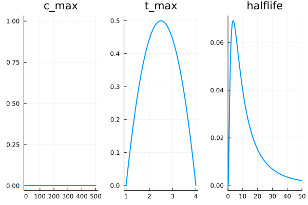
The other component we will want is an error term.
We want to express our observations of the concentration as being noisy samples from a normal distribution centered on the actual curve we are estimating.
So we need an error term which will allow some wiggle room about that curve, without throwing off the inference for the real parameters.
We will define a variable called err which is the standard deviation of this error term.
Our prior on this error term should be positive with a peak at 0 and rapidly tailing off.
Gamma(1, 1) meets our requirement.
plot(Gamma(1,1), title="err", legend=false)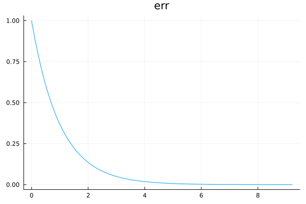
@model function single_dose_model()
    c_max ~ Uniform(0, 500)
    t_max ~ 3Beta(2,2) + 1
    halflife ~ LogNormal(log(3.5)+1, 1)

    dose_f = single_dose(c_max, halflife, t_max)

    err ~ Gamma(1, 1)

    # There is probably a smarter way to do this, but we want to allow observations at different hours
    c1 ~ Normal(dose_f(1), err)
    c2 ~ Normal(dose_f(2), err)
    c3 ~ Normal(dose_f(3), err)
    c4 ~ Normal(dose_f(4), err)
    c6 ~ Normal(dose_f(6), err)
    c8 ~ Normal(dose_f(8), err)
    c10 ~ Normal(dose_f(10), err)
    c12 ~ Normal(dose_f(12), err)
    c16 ~ Normal(dose_f(16), err)
    c24 ~ Normal(dose_f(24), err)

    return (c1, c2, c3, c4, c6, c8, c10, c12, c16, c24)
end
model = single_dose_model() | (;c1=25,c2=100,c3=132,c4=90,c6=82,c8=60,c10=55,c12=32,c16=15,c24=4)
chain=sample(model, NUTS(), 4_000)using StatsPlots
plot(chain)
So let’s look at the distribution over curves (as represented by samples).
using Tables

gr(fmt=:png)  # make sure not to plot svg or will crash browser
scatter(
    [0,1,2,3,4,6,8,10,12,16,24], [0,25,100,132,90,82,60,55,32,15,4],
    label="A200 actual", markercolor=:red,
    legend=false
)

for samp in rowtable(chain)
    f = single_dose(samp.c_max, samp.halflife, samp.t_max)
    plot!(
        0:0.1:24, f,
        linewidth=0.5,
        linealpha=0.005, linecolor=:red, yrange=(0,200),
    )
end
plot!()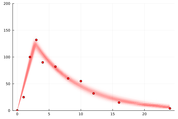
We see this nice kinda clear and fairly small range of values for the parameters: c_max, t_max, halflife.
The error term, err, is quite large
Now that we have shown we can do inference to find distributions over parameters that fit the data let’s get on to a more realistic task. No one gets blood tests every few hours outside of an experimental data gathering exercise. The most frequent blood tests I have heard of is every 2 weeks, and most are more like every 3-6 months. So what we are really interested in is inferring what could be happening with blood levels from a single observation.
The practical case is applying the gel in the morning before work, and getting a blood test toward the end of the work day just before the phlebotomist closes.
So we will look at the sample for c8, the blood concentration 8 hours after dosing.
And we want to see a distribution over all possible estrogen level functions that would lead to that observation.
This is what it is actually all about.
model = single_dose_model() | (;c8=60)
chain=sample(model, NUTS(), 4_000)

scatter(
    [8], [60],
    label="A200 actual", markercolor=:red,
    legend=false
)

for samp in rowtable(chain)
    f = single_dose(samp.c_max, samp.halflife, samp.t_max)
    plot!(
        0:0.1:24, f,
        linewidth=1,
        linealpha=0.005, linecolor=:red, yrange=(0,200),
    )
end
plot!()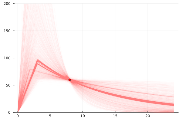
So that’s actually really informative.
There are a range of possible explanations.
From a very small t_max and a large c_max meaning it peaked early and has tailed off a lot,
to the more likely ones which look more like the kind of curves we were seeing based on the experimental data with more frequent measurements.
This is really cool.
We can add more observation points and cut-down the number of realities we might be in. This realistically is actually a practical thing to do. Each point is a blood test – in London trans folk can get them free in the evenings a few days a week at 56T Dean St or CliniQ. In theory some NHS GPs will also do them for trans folk, but many (including mine) will not because the NHS is systematically transphobic and doctors think trans folk are too complex for them. So to get a few in one day you would need to pay privately about £50. Which is nice that we know exactly how much each observation costs.
So we can simulate adding another observation. You can see in the following plots that if we add a reading of 60 at 8 hours after application we break the possible universes into two possible sets of explanations. One set where the 3 hour reading is while it is still rising, and one set where it is falling.
model = single_dose_model() | (;c3=100, c8=60)
chain=sample(model, NUTS(), 4_000)

scatter(
    [3, 8], [100, 60],
    label="A200 actual", markercolor=:red,
    legend=false
)

for samp in rowtable(chain)
    f = single_dose(samp.c_max, samp.halflife, samp.t_max)
    plot!(
        0:0.1:24, f,
        linewidth=1,
        linealpha=0.005, linecolor=:red, yrange=(0,200),
    )
end
plot!()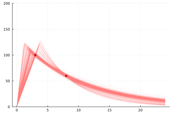
model = single_dose_model() | (;c3=100, c8=60, c1=50)
chain=sample(model, NUTS(), 4_000)

scatter(
    [3, 8, 1], [100, 60, 50],
    label="A200 actual", markercolor=:red,
    legend=false
)

for samp in rowtable(chain)
    f = single_dose(samp.c_max, samp.halflife, samp.t_max)
    plot!(
        0:0.1:24, f,
        linewidth=1,
        linealpha=0.005, linecolor=:red, yrange=(0,200),
    )
end
plot!()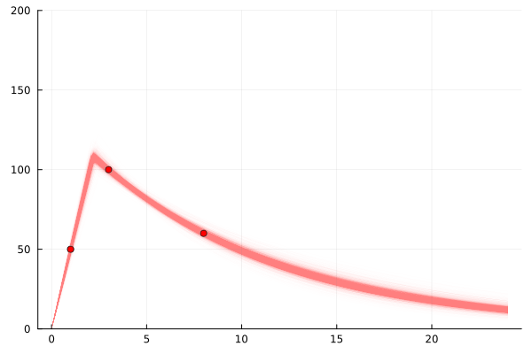
It is worth noting that while these 3 points do lead to a relatively small set of possible worlds, this is not always the case.
Unlike for fitting a multivariate linear (or a number of other curves) one point per degree of freedom is not enough.
For example if all points could be during the first piecewise segment, we know even less about the state of the world than if we had 1 point in the tailing off segment (especially if those points suggest a large error in the readings err)
model = single_dose_model() | (;c1=30, c2=90, c3=90)
chain=sample(model, NUTS(), 4_000)

scatter(
    [1,2,3], [30, 90, 90],
    label="A200 actual", markercolor=:blue,
    legend=false
)

for samp in rowtable(chain)
    f = single_dose(samp.c_max, samp.halflife, samp.t_max)
    plot!(
        0:0.1:24, f,
        linewidth=1,
        linealpha=0.005, linecolor=:blue, yrange=(0,200),
    )
end
plot!()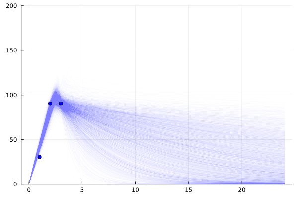
This is just a first look at this topic. I imagine I might return to it again in the future. Here are some extra things we might like to look at:
- Determining optimal times to test: as discussed 3 readings will not always capture the curve, different times may be more informative than others, especially when we consider the error level vs the signal level.
- Average levels: the distribution of average level is likely fairly collapsed – multiple different sets of parameter values can lead to same average level.
- Multi-day: Since estrogen doesn’t hit zero at 24 hours can model across days. Can also include a term for variation in when it was applied in the day since people are not that consistent. Multiday is crucial for making the model realistic
- Dose changes: extending beyond multiday, people change there does, and we know higher dose leads to higher levels so we can insert that prior knowledge.
Probabilistic programming is a cool technique for working on pharmacodynamics. It lets us handle the fact that we have many unknowns about people’s individual biology, while still narrowing down a possible set of worlds they might live in.
Note: feedback from probablistic programming folk have told me that this could be much improved to give more samples that are better representative of the true distribution. At some point I will try and integrate them into this post. Until then see this issue.